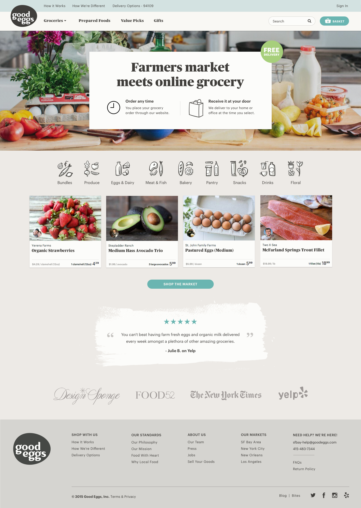
Going into our second quarter of 2015, Good Eggs formed teams around several initiatives one of which was new customer acquisition. The acquisition team (aka team Welcome Wagon) consisted of myself as lead designer with a supporting designer, a lead engineer and 2 additional engineers as well as a marketing stakeholder who was also acting as the PM. We knew that the Good Eggs model was hard to understand and we wanted to really be thoughtful and deliberate around the first time customer experience which hadn’t gotten much love in the past.
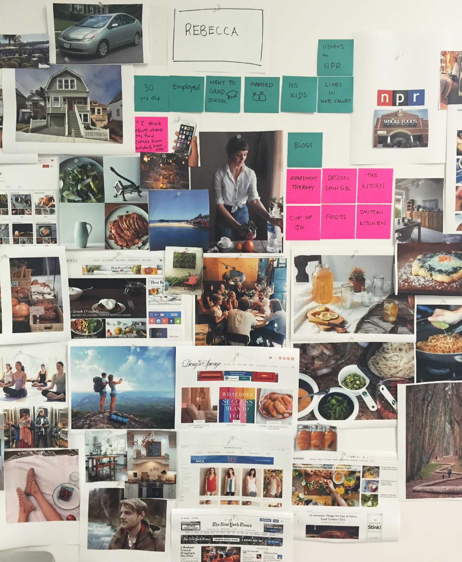
To start things off we had the PM pull numbers around some of our new customer metrics and as a team, we got together to discuss which projects might have the biggest impact. Several projects surfaced and were prioritized. Our first week in, we started by doing user testing of our current site experience to see where we saw obvious opportunities to improve messaging of what Good Eggs is. We did some competitive analysis and also met with customer care to understand what questions they hear most often from customers. Based on this research, myself and another designer started to brainstorm on better ways to explain our service.
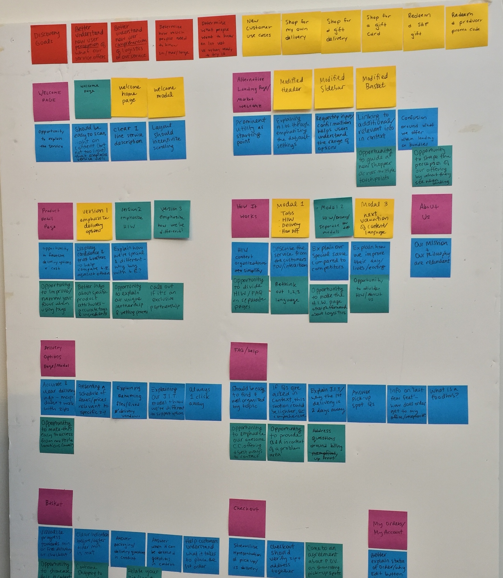

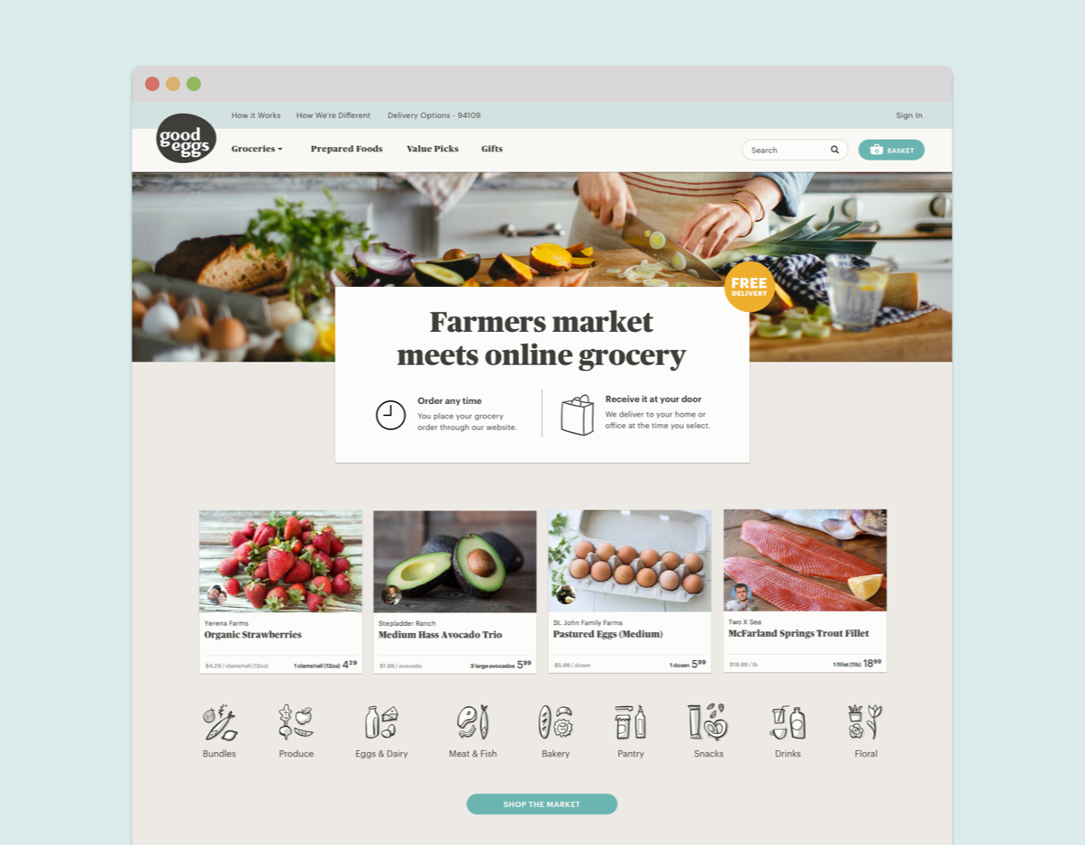
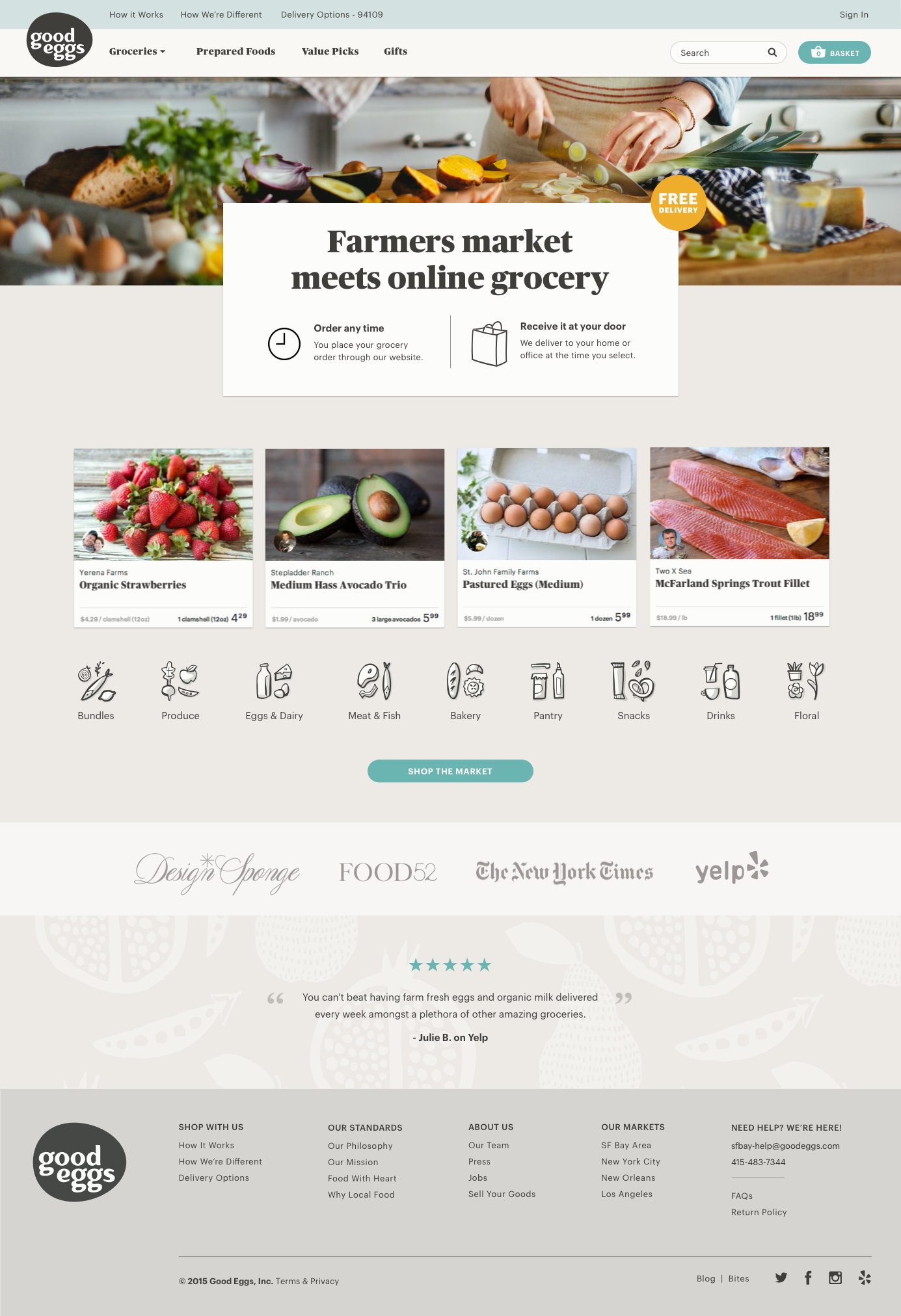
We came up with a few new concepts and did another round of user testing which resulted in a huge improvement on comprehension and understanding of how Good Eggs worked. Our goal was to answer the common questions like, “Do you deliver to me? Is there an order minimum? Do I need to be home to receive my groceries?” A couple concepts that we felt we could pursue were introducing a set of modals accessible from the top nav that would explain how Good Eggs worked. We also wanted to be thoughtful about where a 1st time customer landed and tried out a 1st time customer homepage which doesn’t currently exist in the experience. We felt it could be disorienting to land in a market page without really understanding what Good Eggs was about and what you could do here. A homepage could tell more of a story at a glance.
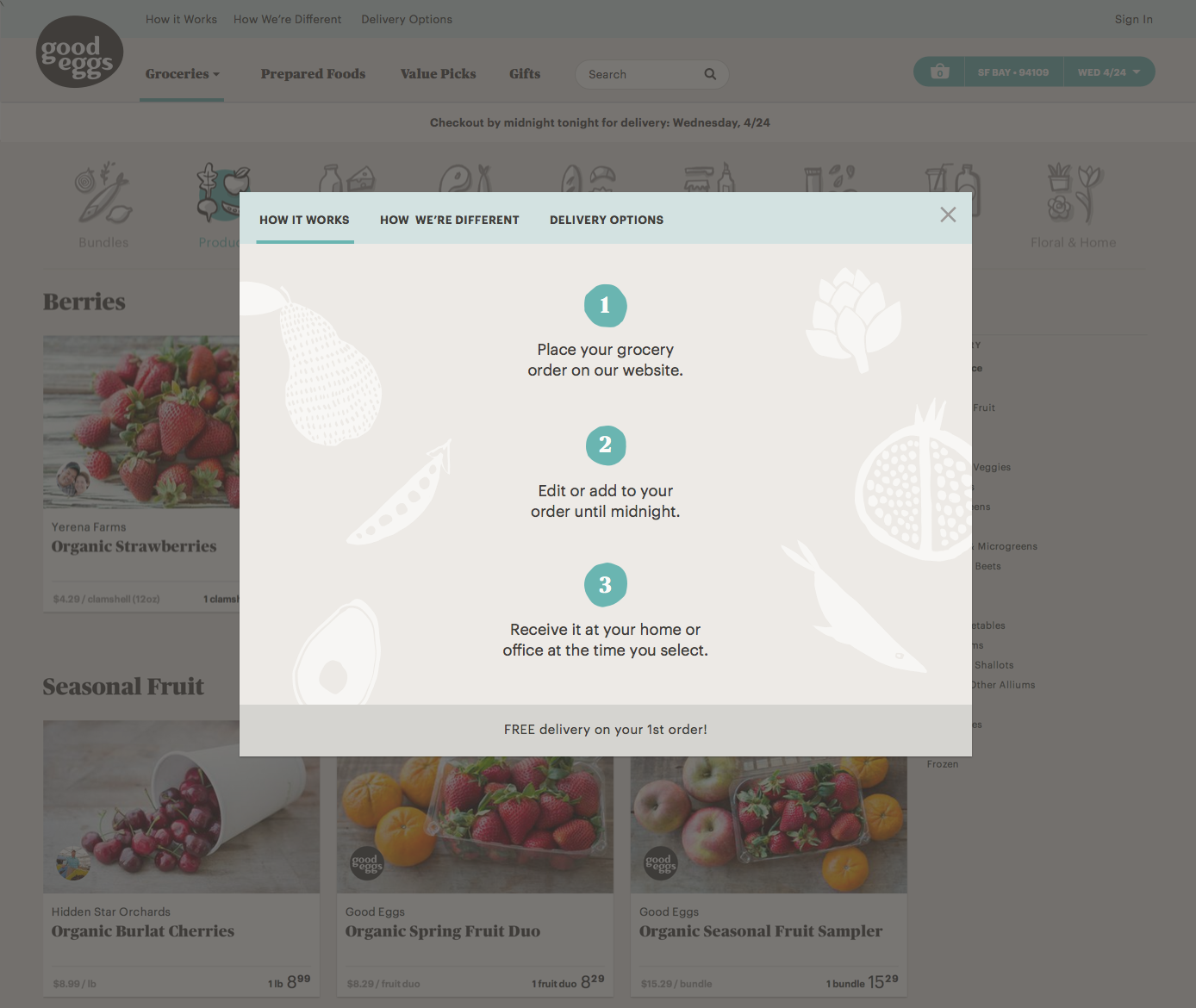
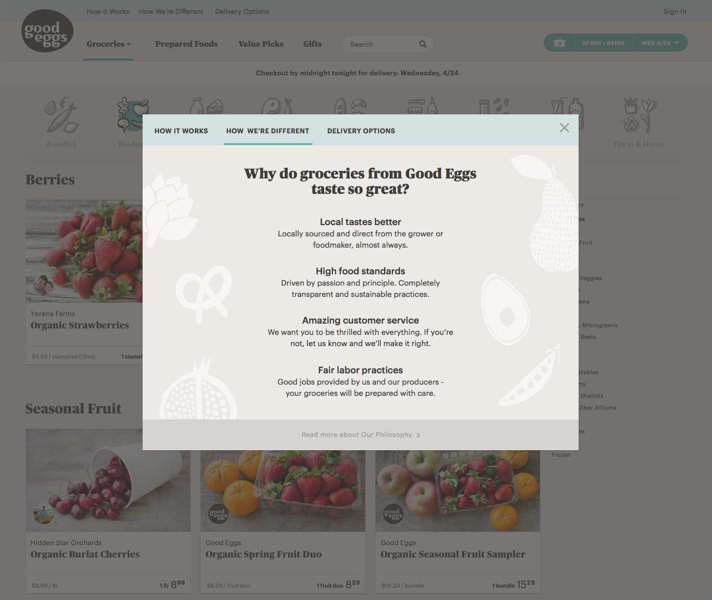
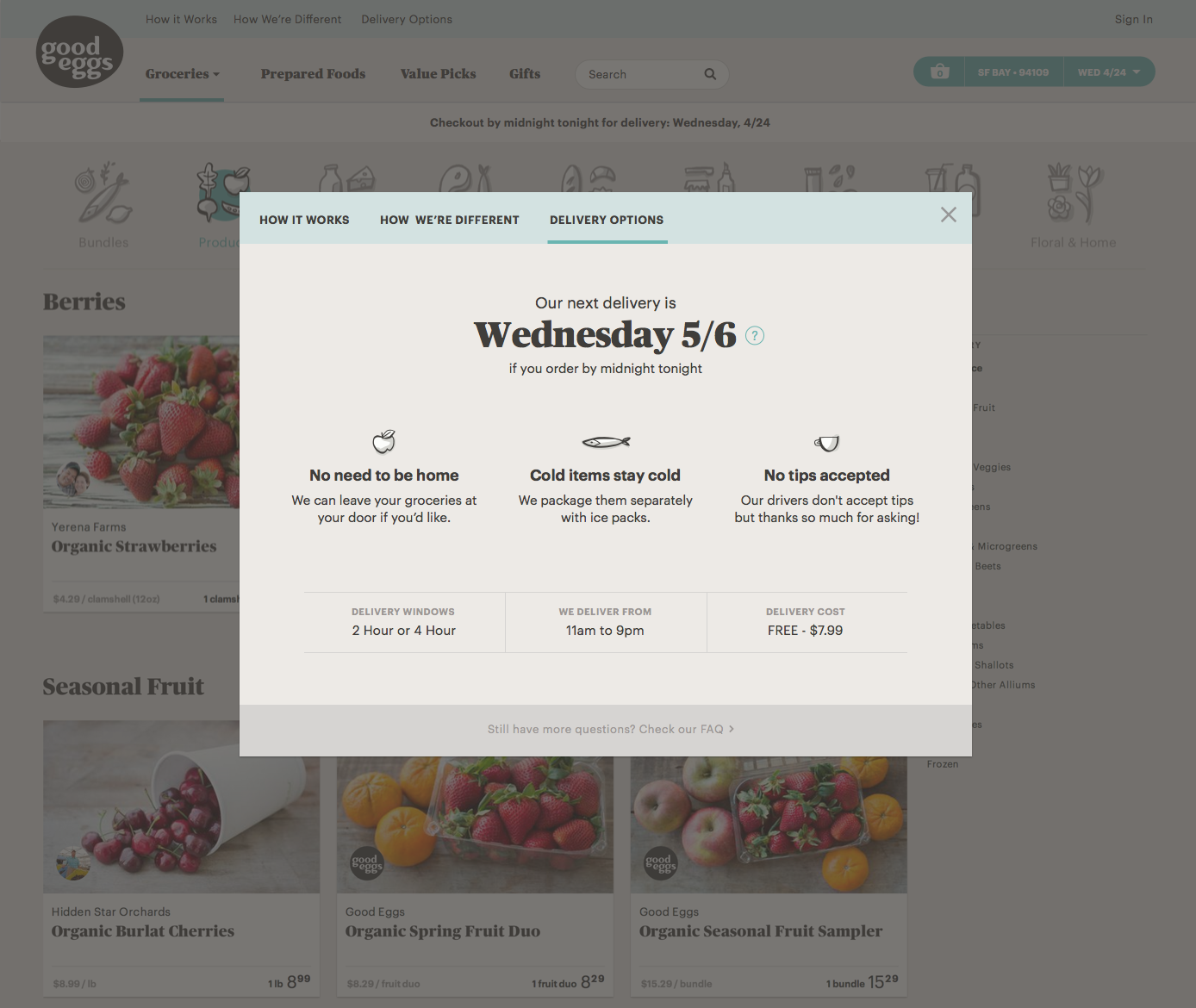
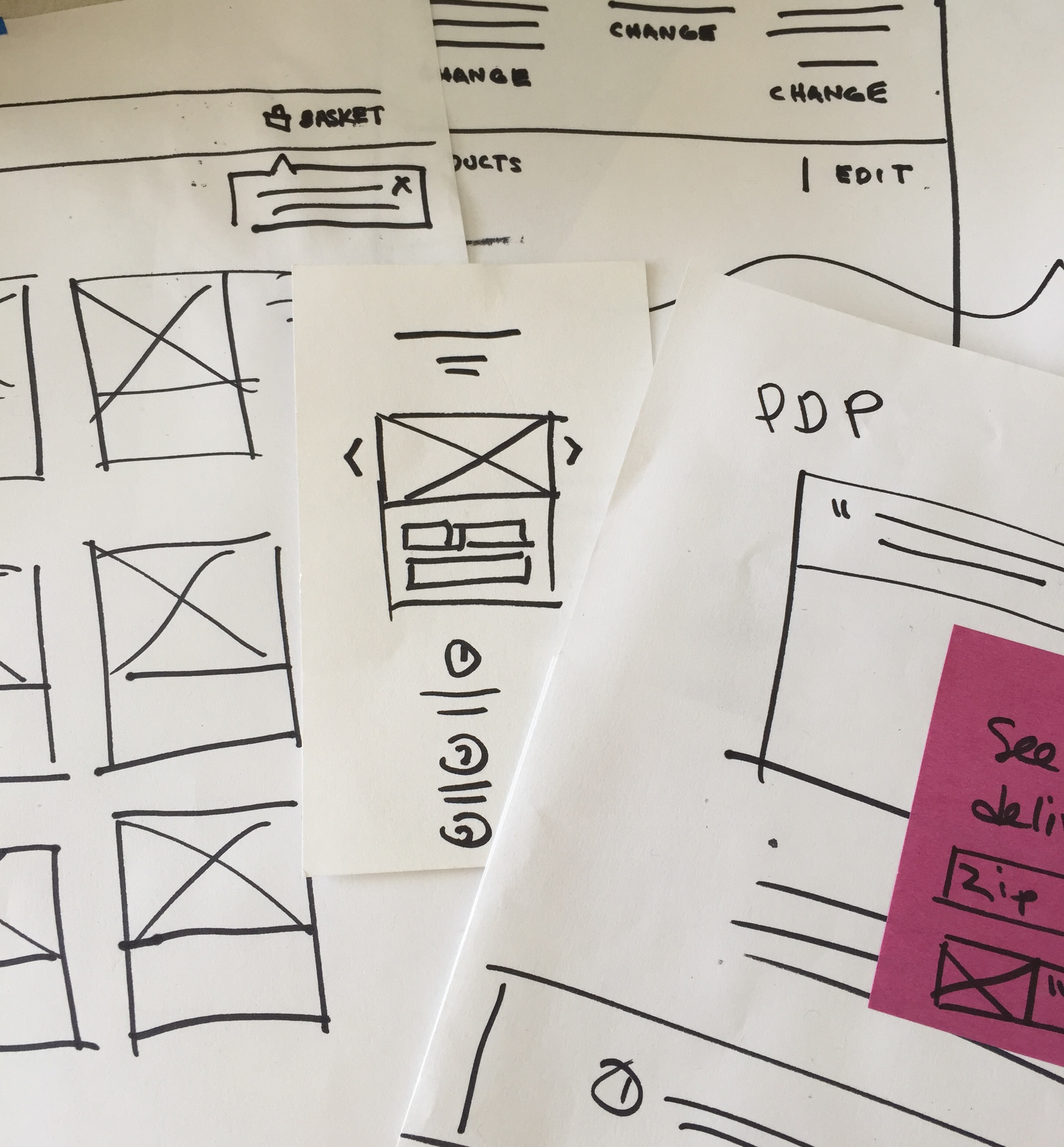
After user testing, we did a few more iterations on the modal designs both in terms of layout/hierarchy and visual design before starting implementation. After launch, we learned that customers that interacted with any of the modals were 7 times more likely to make a purchase.
Next up we focused on improving the basket page if someone visited and hadn’t added any items yet. It was pretty bare bones with a text link to shop and surprisingly a lot of new visitors were ending up there. We wanted to make it very apparent that they hadn’t added any products yet and possibly provide messaging around how Good Eggs works along with showing cross-sells. This initiative felt like a quick win overall and it was possible users were going here to get answers to how the service worked.
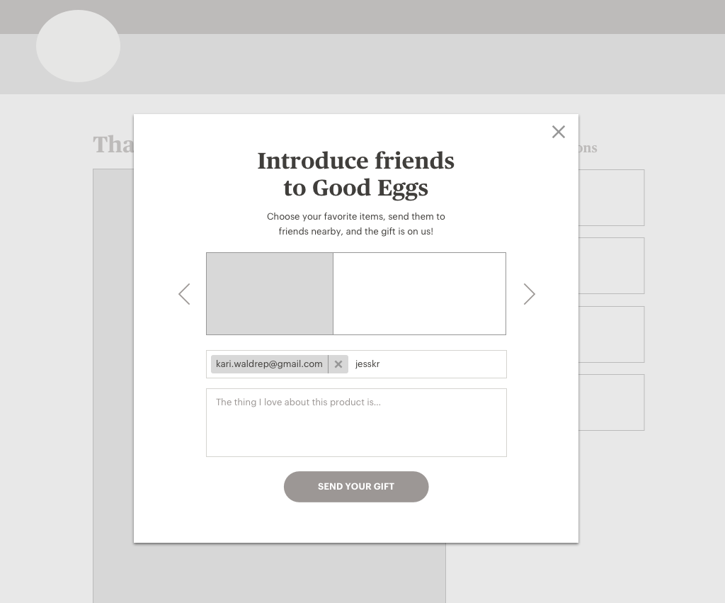
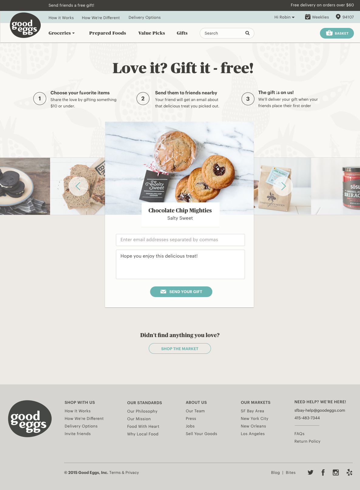
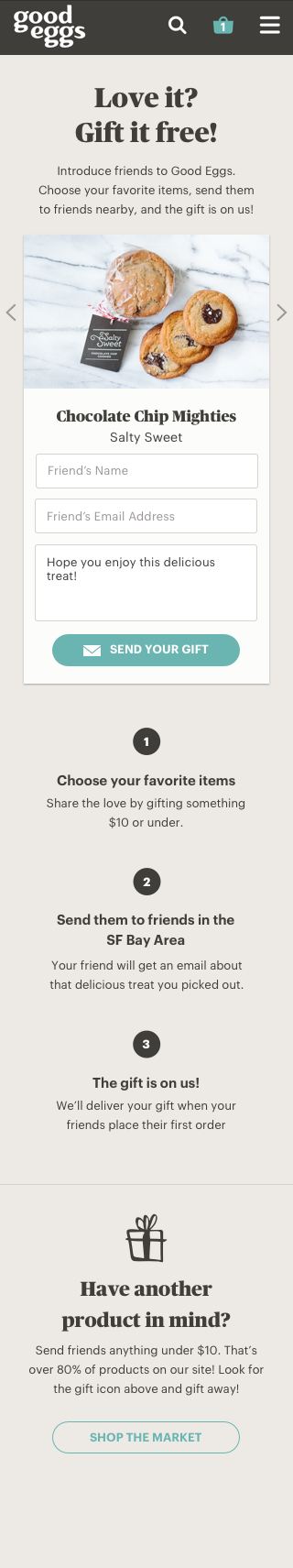
Good Eggs had launched a referral program about a year ago in which registered users can gift products under $10 for free to new users when they place their 1st order. This program was not something most customers were aware of because products could only be gifted from the product detail page and a promotional email that is sent to soon after their 3rd order was placed. Ultimately this program lacked awareness and there wasn’t a home for this program to explain how it worked. This initiative felt important because most new visitors that were gifted a product from a friend were very likely to place an order.
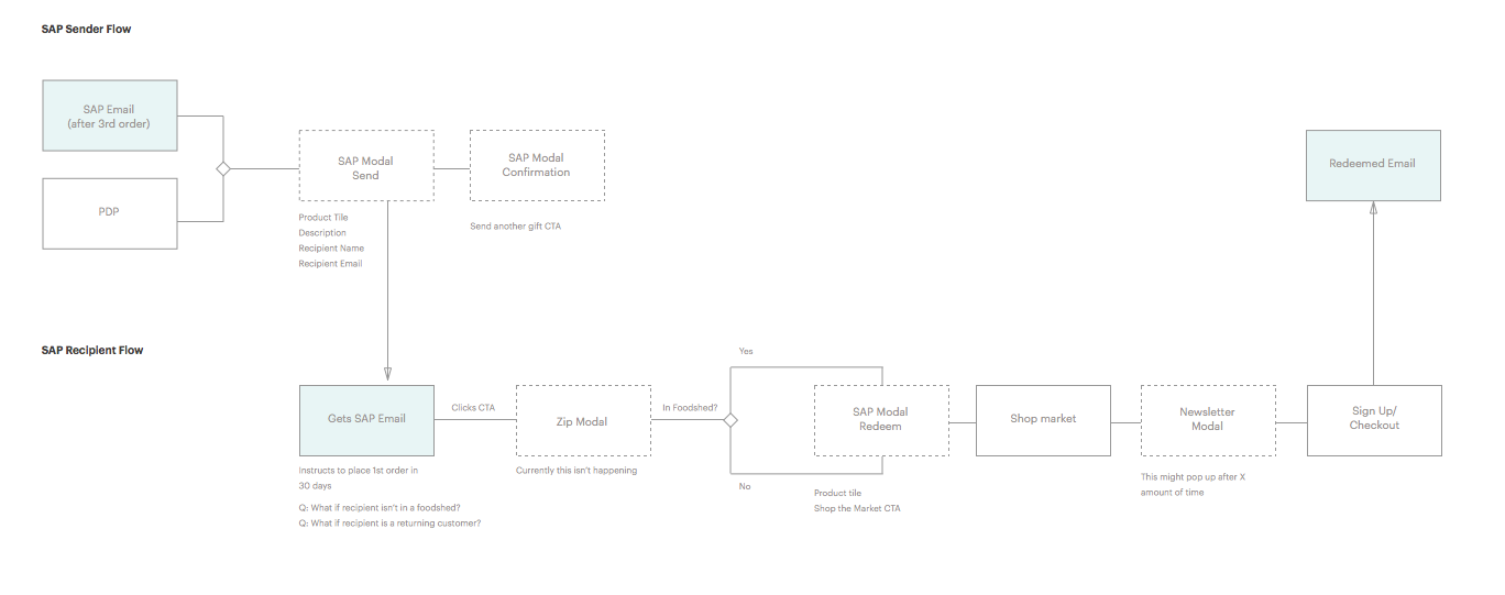
After some initial design exploration we decided a landing page would provide marketing with a destination to link to as well as better explain how the program worked. We had other ideas like allowing for gifting after placing an order or linking to a category page filtered by giftable items but given our week timeframe we decided to start with the landing page and going from there.


Team welcome wagon did a lot in regards to the new customer experience and I'm proud of the work we achieved in such a short amount of time!
APRIL 2015